Bigelow & Holmes Blog
More Zero versus Oh and ellipses versus superellipses
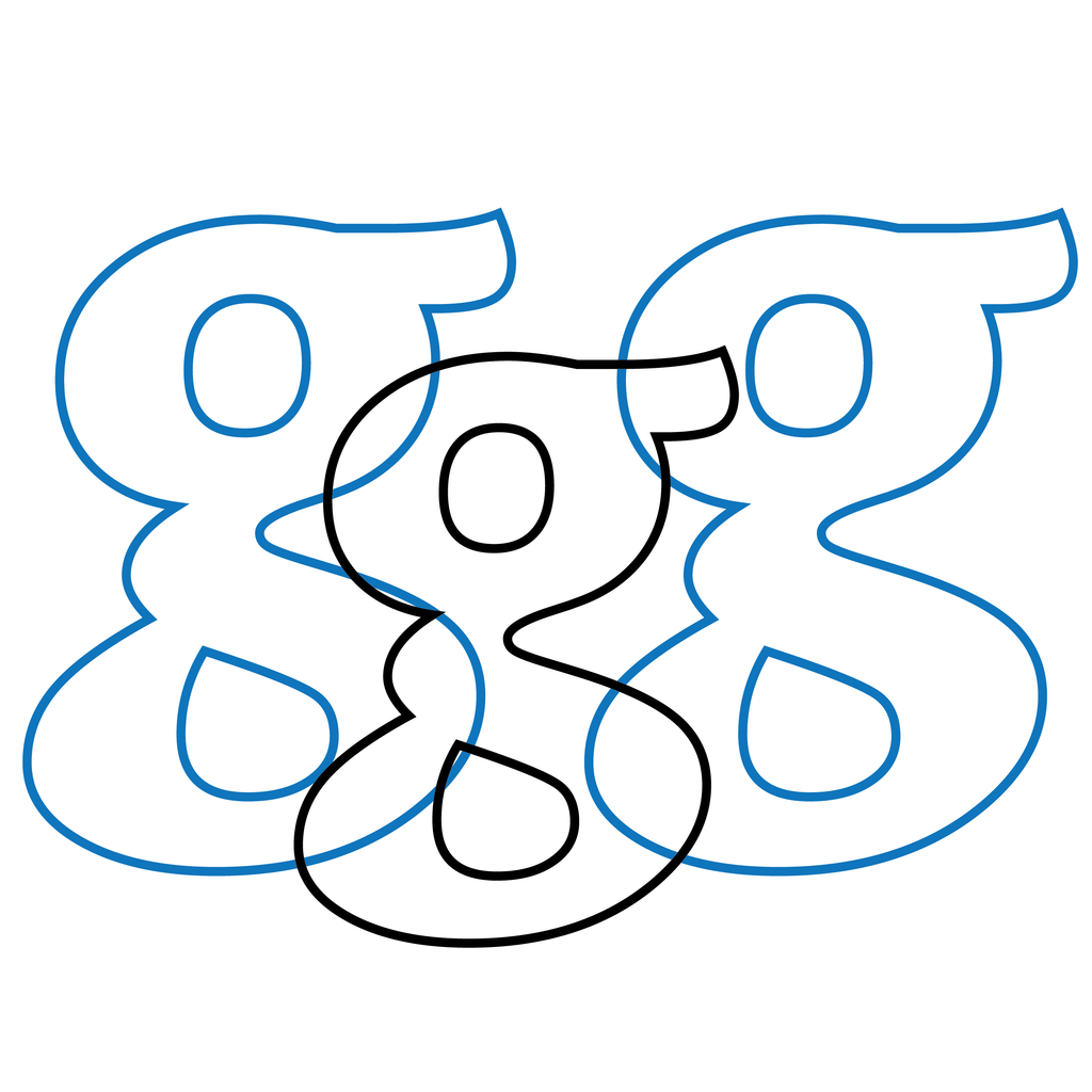
In 2013 I wrote an article on the history of visual confusion between the shapes of the numeral zero and the letters 'O' and 'o', a perennial problem in monospaced computer fonts. Historically, though, the problem goes way back before the inventions of computers, typewriting, and typography. It has influenced the development of typographic numerals, and, in recent times, stimulated a wide variety of solutions in computer typography, as the article explains. The essay was first published as "Oh, oh, zero!" in TUGboat: The Communications of the TeX Users Group, Vol. 34, No. 2, pp. 168-181, 2013 (http://tug.org/TUGboat/tb34-2/tb107bigelow-zero.pdf) and later was published in French translation by Jacques André as "Histoires...
Digital Type archaeology: Principles of Digital Type 2.1
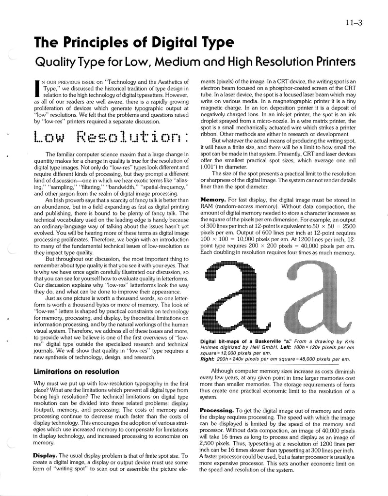
The August, 1981 Seybold Report article on aesthetics versus technology of digital type elicited requests for an additional article about digital typography for medium and low resolution devices, so it was followed by a pair of articles in February, 1982. As before, Chuck Bigelow wrote the article, Kris Holmes illustrated it, and Jonathan Seybold edited it and wrote an introduction (not reproduced here). Readers today will recognize that much has changed in digital type over the past 33 years, but because we constructed the article from first principles of digitization instead of focusing on technical details of then-current (and now...
What's the Difference between Lucida Grande and Helvetica Neue?
Both have double names, though of different meanings and origins.* Both are sans-serif typefaces, though of different design philosophies. Both have been system fonts on Macintosh OS X, though one in the past and one in the present. Both have system and non-system variants, though their character sets vary. There are measurable differences between Lucida Grande and Helvetica Neue in letter forms, letter spacing, letter widths, and other metrics. There are qualitative differences in aesthetics, graphical origins, and design classification. There are apparent differences in readability. depending on context and text size. We discuss these in the sections that follow. ...
From Casual to Textile to Marker: the story of a font
IN SHORT In 1993, Bigelow & Holmes designed a font named Lucida* Casual Italic, based on informal handwriting. In 1998, B&H designed for Apple a font named Textile* which looked like a sumo wrestler version of Lucida Casual Italic - bigger, bolder, brawnier. In 2014, Bigelow & Holmes released a font named Lucida Marker, which is a dead ringer for Textile. Here’s the story. DESIGN PROCESS In 1990-91, Bigelow & Holmes created Lucida Handwriting, an informal joining script. The font became widely used after its release by Microsoft in 1992. Some two years later, we designed two informal, non-joining fonts...
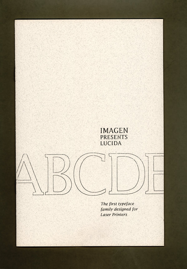
How and Why We Designed Lucida